Is concept mapping "science" or "art"? Can we legitimately claim that concept maps represent reality, or are they primarily suggestive devices which might stimulate new ways to look at our experiences? Here, the scientific side of concept mapping is viewed as "soft science" and the artistic one as "hard art" to imply that the process has some qualities of both, but probably does not fall exclusively within either's domain. In the spirit of hard art, a "gallery" of final concept maps from twenty projects is presented, partly to illustrate more examples of the process when used in a variety of subject areas and for different purposes, and partly for their aesthetic value alone. In the spirit of soft science, two major issues are considered. First, the evidence for the validity and reliability of concept mapping is introduced, along with some suggestions for further research which might be undertaken to examine those characteristics. Second, the role of concept mapping is discussed, with special emphasis on its use in a pattern matching framework.
One of the lingering questions regarding concept mapping is: should it be considered primarily a "scientific" process or an "artistic" one? Without getting into the voluminous literature on the distinctions and commonalities between art and science, we might at the least assume that science strives for objectivity -- for an agreed upon consensus about reality -- whereas art is more subjective in nature -- striving to reach and challenge our perspective on reality in a unique, personal manner. Perhaps even posing the issue dichotomously obscures some of the commonalities between art and science. After all, like art, science requires creativity and insight especially in theory development stages. And like science, art requires a mastery of skills, methods, tools and technologies.
This paper does not provide an answer to the question. As with most issues which are dichotomously framed, it may very well be that the truth of the matter lies somewhere in the middle. Concept mapping may result in both a representation of reality and an interesting suggestive device. In anticipation of such a non-conclusion the title of this paper has been tempered somewhat, describing the scientific side of concept mapping as "soft science" and the artistic one as "hard art" to imply that the process has some qualities of both, but probably does not fall exclusively within either artistic or scientific domains. This paper will examine the concept mapping process from each perspective -- viewing it as an artistic procedure which yields interpretable, suggestive conceptual pictures and as a scientific one based upon sound evidence regarding its validity, reliability and theory-enhancing value.
The question of whether concept mapping is primarily hard art or soft science is an important one on several counts. First, it is essential that those who use the process not misrepresent it to clients. It is easy to believe that the maps which result have a quality of finality to them -- they imply objectivity and scientific truth; they seem to represent some group conceptual reality. If this is not true -- and our clients believe that is is -- then we are deceiving them and practicing scientism of a most insidious type. Second, concept mapping would have different uses, depending on how we choose to answer the question. If it is a credible scientific procedure, we might use it as the basis for developing theory, as a way to develop theoretical patterns for pattern matching, or as the basis for generalizability of inferences (Trochim, in press). If concept maps are not justifiable as accurate representations of some underlying reality, they might alternatively be considered primarily as suggestive devices, useful for their stimulative or creative value. In this latter case, the focus would be more aesthetic in nature -- how do we generate interesting maps which suggest new ways of looking at familiar problems? Finally, the way in which we evaluate the effects of concept mapping would differ depending on whether it is hard art or soft science. From a scientific viewpoint, we would want to know the degree to which concept maps are reliable, valid and parsimonious in their representation of theory or data. From an artistic point of view we would be more concerned about the aesthetic judgment of the participants -- the degree to which the map is pleasing or interpretable -- and we would look at the effects of the process on stimulating new ideas, or facilitating subsequent planning or evaluation efforts.
The next section is in the spirit of artistry and aesthetics and presents a brief gallery of concept maps from a variety of different projects. These maps provide more examples of the concept mapping process and will illustrate a variety of techniques for graphing concept maps. The section after that presents some of the scientific issues which have been raised and suggests some of the research which needs to be included on our agenda for further investigations of the concept mapping process.
As with all art, beauty is in the eye of the beholder. Because concept maps are the product of a fairly complex set of group interactions, it is reasonable to expect that even for people within the participating group, appreciation and understanding of a concept map will differ. If so, then it is almost certainly the case that someone who did not participate will have more difficulty in understanding what a concept map means to the participants. Every mapping process involves a unique group of individuals who come to the process with their own experiences, jargon, and motivations. The outside viewers of a map are not privy to this and, instead, apprehend the picture with their own perspectives and biases. It is worth recognizing, then, that there is the effect of the concept map upon the participant group and organization(s) and its effect upon some outside viewer of it , and that these two may not be in agreement.
Here, we review briefly the final concept maps from twenty different projects (only one of these has already been seen in the introductory chapter of this volume). These projects are included here for a number of reasons. They illustrate a wider variety of subject areas for the application of the concept mapping process. They show different graphing techniques which can be used to display concept maps. They depict different purposes and uses of concept mapping. But perhaps most of all, you may find that some of the maps are simply "pretty" and interesting to look at. Unfortunately, only final maps can be presented here due to space limitations. More detailed descriptions of any project may be requested from the author.For several projects, the anonymity of the organization is preserved (usually at their request). The twenty projects and their major characteristics are described in Table 1.
They range over a five year period beginning in the summer of 1983 and with the most recent ones conducted in the spring of 1988. They range in size from projects with as few as 4 participants to as many as 75; as few as 11 statements or as many as 137. The participants include organizational staff, board members and client groups. These projects represent an evolution in our understanding of concept mapping from some of the cruder early attempts to more sophisticated recent ones. The twenty projects are classified by subject areas in Table 2.
Most of the projects are related in some way to education, but there are also other fields well represented. Some projects are pertinent to multiple subject areas. For instance, project 10, the Community School of Music and Arts, is classified in four subject areas -- education, educational administration, children and youth, and the arts -- even though its primary emphasis was on the improvement of administration of the school. The projects are classified by purpose in Table 3.
The vast majority of projects were conducted for planning and/or management purposes. Although all of these projects generally followed the procedure described in the introductory chapter of this volume, there were slight variations over time. For instance, early projects did not incorporate rating data into the maps. Also, the quality of map production generally improved over time. Each project will be described briefly and its final concept map presented.
1. Multicultural Awareness Camp. In the summer of 1983 a group of youth workers constructed a camp program for local high school children. But this day camp had a unique twist to it -- it was designed to help the children become more aware of different groups and cultures, and to raise issues of class, race, gender and sexual orientation for individual and group thought, discussion and action. The day camp was an intensive 4 1/2 day program with ongoing follow-up in the school and community.
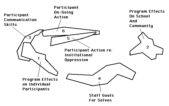
The purpose of this project was to develop a map of the staff's goals for the program so that the staff might be better able to understand what the students might get from it and how they themselves as staff might benefit. To generate the statements for concept mapping four core staff members responded to two questions:The final cluster map for the 74 generated statements is shown in Figure 1.
The map seems divisible into three separate regions of clusters, one each for participant effects, school and community effects, and effects of the program on the staff. The participant effects are, not surprisingly, the most detailed, with a total of four clusters grouped in the upper left of the map, one each for the effects on: individual students (e.g., reach a clearer sense of self; feel safe to explore difficult or confusing topics); communication skills (e.g., talk to each other in more respectful, less hurtful ways); on-going action (e.g., continue having these kinds of dialogues with each other and other adults); and, action regarding institutional oppression (e.g., learn effective ways of challenging institutional oppression with support from each other). Staff effects are shown in the cluster at the bottom of the map (e.g., want to know what kinds of approaches and processes work best in enabling young people and adults to explore issues of racism, sexism, etc.). The effects of the program on the school and community (e.g., teachers will examine the kinds of information which gets transmitted to kids) are shown in the cluster on the right of the map.
The map gave the staff a visual image of what they hoped to achieve and helped assure that all staff had some common sense of what the program was about. The map was also used as the basis of a qualitative interview assessment of the program conducted subsequently.
2. Division of Campus Life. The Division of Campus Life (DCL) is an administrative unit at Cornell University responsible for delivering a great variety of services (e.g., student residences, transportation, safety, dining, counseling, health, etc.) to the University community. It is comprised of eleven different departments which vary according to size, organizational structure, and type of function performed. The goal of this project was to produce a map which could be used as an organizing device for the long-range planning effort of the DCL. This project and the broader planning effort have been described in greater detail in Trochim and Linton (1986) and Gurowitz, Trochim and Kramer (1988).
This was a very large project compared with the others reported here. At any given stage, there were approximately 45 people involved representing the eleven departments. The focus for the brainstorming was the mission statement of the DCL. The statement logically divided into three major phrases and one brainstorming session was held for each. Because of the number of people, 876 statements were originally brainstormed. This was clearly too many and so a subcommittee of four participants was appointed to examine the set of statements for redundancies and they reduced them to a final set of 137. The final map is shown in Figure 2.
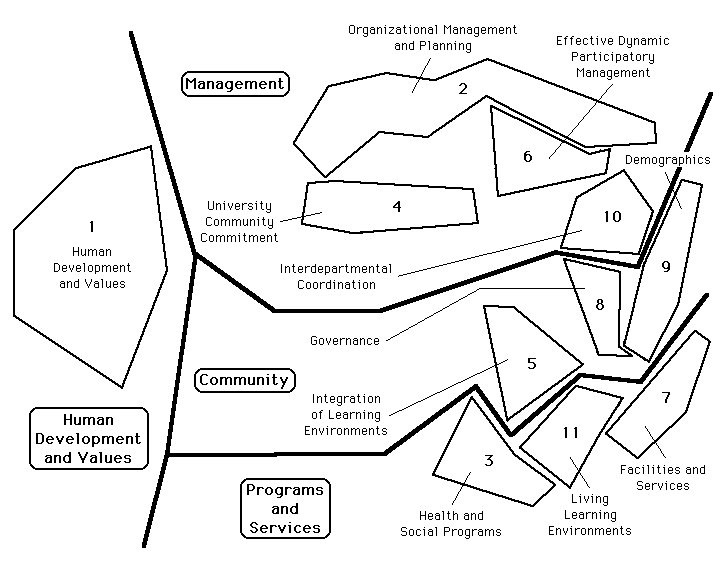
The map was divided into four general regions. On the left side, and considerably distant from the other three regions is the one labelled "human development and values." Most of the items which fell into this category were short general statements. The three regions on the right (management, community, programs and services) contained statements which tended to be longer and more concrete in nature. One reason for this left-to-right split might be because of the three-part focus (based on the mission statement) which was used. One part of the mission statement seemed to call for more general value statements while other parts implied more concrete actions.
The map for this project formed the basis of subsequent long-range planning as described in Trochim and Linton (1986) and Gurowitz, Trochim and Kramer (1988). In addition, the next two projects described below were direct offshoots of this original project and were also connected with DCL planning.
3. University Health Services. This project was conducted to provide a framework for long-range planning for the University Health Services (UHS) which is a department in the Division of Campus Life described above. At any given stage there were between 50 and 75 participants, with virtually everyone in the department participating in at least one stage. For the brainstorming, participants were asked to generate statements which describe what the UHS "should be or should do." Because of the number of participants, three separate brainstorming sessions were held with about 25 persons at each. A total of 315 statements were generated and 100 were randomly selected from these to produce the final set. The map which resulted is presented in Figure 3.
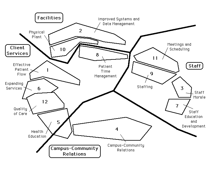
The map is divided into four regions and twelve clusters. In this map, directions appear to be directly interpretable. Moving from the top to the bottom implies moving from more managerial or administrative issues to ones that are more educational or service related. Movement from left to right denotes a change from external, service and client-related issues to the more internal concerns of the staff. To utilize the map, the participants were divided into small groups which were responsible for generating specific recommendations for action (action statements) for different regions and clusters within regions. As a result, 145 action statements were generated and each was addressed by the planning committee in subsequent meetings. This project is described more fully in Trochim and Linton (1986).
One especially interesting interaction occurred in connection with the naming of Cluster 11: Meetings and Scheduling. This cluster contained a number of statements which reflected staff dissatisfaction with the current arrangement of staggered lunch times (thereby preventing some staff from going to lunch together) and frequent required "sack lunch" meetings (thereby preventing them from leaving the building). For whatever reason, the staff had not previously felt comfortable in stating their displeasure with these arrangements, perhaps because they did not feel powerful enough to affect the policies. During the naming of the clusters -- a session in which everyone in the organization (including the director and manager) participated -- one of the participants kiddingly suggested that the cluster be named "Eat -- not meet!" There was an immediate and vigorous round of applause to this tongue-in-cheek (but very heartfelt) suggestion. Afterwards the director confided that he had had no idea that there was a problem -- from his perspective, the lunch times had been staggered to provide continuous coverage and the "sack lunches" had been added to provide more inservice for staff -- both goals which he assumed the staff supported. The cluster naming session enabled the staff to make their feelings about these policies felt in a very direct way and, at the same time, preserved their anonymity and mitigated their fears about confronting their bosses.
4. DCL Subcommittee. Following the major concept mapping process for the DCL as described earlier, a subcommittee was formed whose responsibility it was to write the long-range plan for the Division. This subcommittee consisted of eleven members, one representing each department. One of the first issues which they needed to address was the question of whether all of the eleven departments in the Division actually made sense there or whether some should be moved under another branch of the University administration. Obviously, long-range planning could not proceed until some agreement was reached about what departments were in the Division. In addition, it seemed to subcommittee members that some departments had more in common than others and that they could be involved in more active collaboration, planning, staff interaction and exchange, and so on.
To examine these issues, we decided to do a concept mapping of the eleven departments to see how the subcommittee members would group them. Instead of using brainstorming to generate statements, the names of the eleven departments were used. Instead of sorting the statements, all pairs of departments were rated on a scale from 1 (least similar) to 100 (most similar) and these ratings were standardized and averaged across subcommittee members. The map which resulted is shown in the top part of Figure 4.
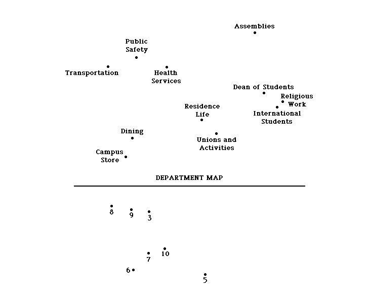
The map shows some interesting distinctions. The departments on the left are by far the largest in terms of budgets, number of FTEs, and so on. They also tend to be devoted to providing basic services such as transportation, health, safety, food (dining), and general goods (campus store). Departments on the right of the map emphasize services and counseling. The departments in the lower right corner in general tend to deal primarily with students whereas other departments tend to serve the broader university community. The major reorganization question centered around whether the three departments on the far right should be moved to a different administrative part of the university where they would be with other departments which provided services and counseling directly to students.
In the subcommittee discussions, it became apparent that most members were content with the current structure -- there were two advocates for reorganization, both of whom represented student service departments on the right of the map. The two advocates were outspoken, articulate proponents of their position -- most others in the group did not reveal a strong position in the face of this advocacy. After many lengthy meetings discussing reorganization, we decided to use the data from the concept map in Figure 4 to construct a "person" map to see whether it might help move the issue along. Again, we used the rating data, but this time we scaled people (using the INDSCAL model for multidimensional scaling). The map which resulted is shown on the bottom of Figure 4. The identities of the subcommittee members were not indicated on the map -- only arbitrary ID numbers known only to the facilitator were used. What was particularly remarkable was that everyone in the group immediately identified the two persons in the lower right corner correctly as the two strong advocates for reorganization. There was a laugh of recognition, very little discussion, and the reorganization issue was never seriously raised again! While it is purely conjecture, it seems reasonable that the person map made it clear that there was a strong majority opposed to reorganizing and the two vocal advocates simply dropped the issue given that they were clearly outnumbered.
5. The Mental Health Association. This project was undertaken to provide a framework for designing a training program for volunteers who were to work on a one-to-one basis with deinstitutionalized mental patients. A new staff person had been hired for this purpose by the Advocacy Committee of the Board. The dilemma which faced this new staff member was that it was not clear what the Advocacy Committee wanted the volunteers trained to do. If the staff member went ahead and designed something that seemed sensible, it might not adequately represent the original thinking of the Board Members. Therefore, the Advocacy Committee was encouraged to use concept mapping as a way to represent their thinking for the new staff member. The map which resulted is shown in Figure 5.
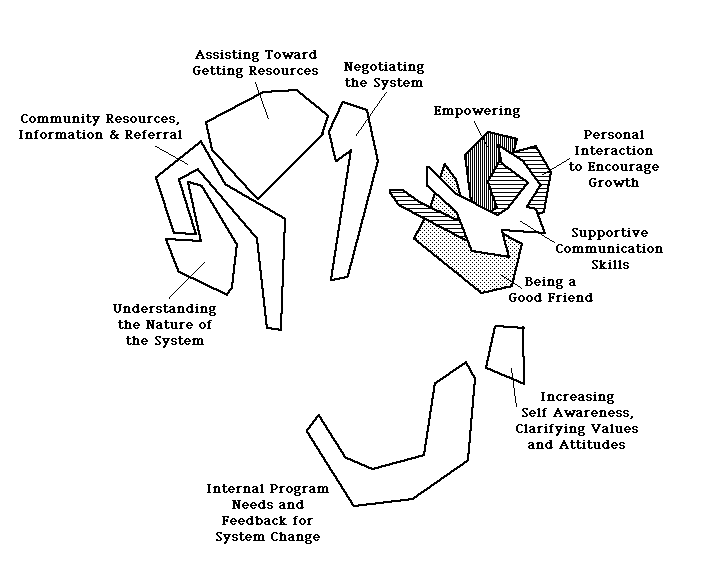
The training program was constructed so that each cluster was represented in the sessions. Individual statements within clusters were used to suggest specific skills which needed to be taught. For instance, the cluster Supportive Communication Skills had the statements "listen attentively", and "be comfortable with hanging out together without talking." The cluster Assisting Toward Getting Resources had the statement "help clients find housing." Each of these statements was covered in some way in the training sessions. Although it wasn't done here, the same map structure could be used to evaluate the implementation and effectiveness of the program. In this project, consequently, the new staff member was able to solicit specific, concrete guidance from the relevant Board members regarding the nature of the program as they saw it -- certainly better than trying to second-guess what they might have wanted.
6. Teaching Measurement. This project was accomplished in two class sessions as part of a graduate level course in measurement. It was conducted early in the semester in order to determine what the group perceived as the major issues in measurement and the interrelationships between these issues. Students were prompted simply to generate statements which describe what they thought about "measurement." The map which resulted is shown in Figure 6.
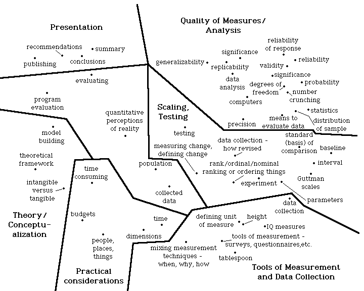
The students identified six clusters for the fifty statements. What is especially interesting is that they perceived a counter-clockwise pattern across clusters which described the measurement process from beginning to end. Measurement begins on the far left of the map with the cluster Theory/Conceptualization (e.g., theoretical framework), then to Practical Considerations (e.g., how time consuming, budgetary factors), onto Tools of Measurement and Data Collection (e.g., surveys, questionnaires, etc.), to Scaling and Testing" (e.g., ranking or ordering things), to Quality of Measures / Analysis" (e.g., reliability, validity, precision), and finally onto Presentation (e.g., summary, recommendations, publishing). This process showed the students that they already (collectively) knew a considerable amount about measurement, and at the same time it introduced them to the ideas of multidimensional scaling and cluster analysis -- topics which were covered later in the course.
7. Cooperative Extension. Cooperative Extension has a rich history in community issues programming (CIP) which has become known as a specialty often separate from the more traditional subject areas of agriculture, home economics and youth development (4-H). Many of the community issues selected for educational programs have been in land use, agriculture districts, economic development and local government. While these are important areas for local policy making, topics more germane to home economics or human ecology have not been addressed by most CIP specialists despite the fact that Cooperative Extension home economics agents have undertaken many programs that include a "community issues" component (e.g., daycare, housing for the elderly, water quality, and consumer rights).
A steering committee was appointed to strengthen the awareness of community issues within home economics subject areas and to provide a strategy for increasing the skills and resources of faculty and agents who have a focus on educating families to incorporate more policy education into this subject area programming. Concept mapping was used to facilitate the planning process of the steering committee; to provide a benchmark for future evaluation; and, to represent the perceptions of county agents, faculty at the state university with at least 50% extension time, and administrators. Participants were randomly selected from subsets of Cooperative Extension personnel whose main focus is in home economics or human ecology programs. They were asked to brainstorm ideas which "describe your view of what a policy education program for individuals and families in Cooperative Extension should be." A total of 273 items was generated, with 75 randomly selected for use in concept mapping. Items were mailed to participants for sorting. The steering committee was responsible for interpreting the final map shown in Figure 7.
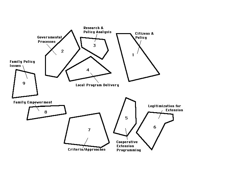
The map is divided into nine clusters: Citizens and Policy ("citizens learn how to analyze concerns" and "...impact on political process"); Governmental Processes ("state government legislative process", "local government decision-making..."); Research and Policy Analysis ("What are the likely effects on decision outcomes from different forms of citizen participation?"); Local Program Delivery ("Explain how program can help individuals and families"); Cooperative Extension Programming ("'Packaged' ideas for agents"); Legitimization for Extension ("aim to develop public awareness", "success stories from other counties"); Criteria/Approaches ("program should aim at pre-school, youth, adult and aging populations in the context of the family"); Family Empowerment ("helps families understand tax problems", "parent forum: address problems of today and how handled"); and, Family Policy Issues ("support of child care", "environmental issues: water policy, safety"). The map is useful for specific planning efforts. For instance, one committee member suggested that the cluster categories be used as guides for developing materials for Cooperative Extension staff to have for in-service education opportunities and reference. The specific statements within clusters would provide concrete examples of the topics which materials could address.
8. Student Life (R.A.s). This concept mapping project was conducted to explore the issues which college students perceive as important. Twelve Residence Advisors (R.A.s) -- students who live in the dormitories and have some supervisory and peer counseling responsibilities -- were engaged as participants. The R.A.s were asked to generate statements which "represent what you perceive to be important in the lives of undergraduate students." A total of 129 statements was generated. It was hoped that the concept map would provide a framework which would help the R.A.s to plan better and more comprehensive programs for their students. The final map is shown in Figure 8.
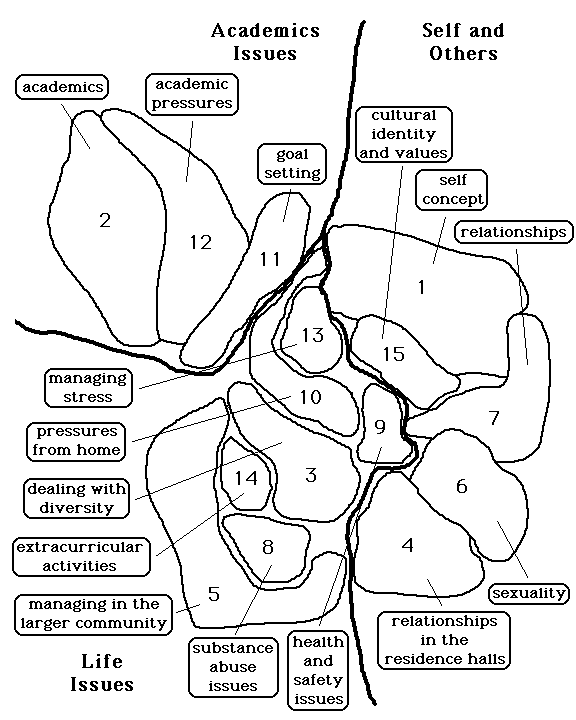
The map is divided into three general regions (Academic Issues, Life Issues, and Self and Others) and 15 clusters. There are a number of uses for the map. R.A.s could examine currently planned programs and mark all areas on the map which are addressed in some way. This would show, at a glance, which topics are emphasized and which, if any, are neglected. The specific statements within clusters might provide concrete suggestions for what types of programs might be useful. The map may also suggest interesting relationships which could be emphasized in programs. For instance, the clusters Goal Setting, Managing Stress, and Pressures From Home are close together on the map. This suggests that the topics are strongly related and it might be valuable to construct programs which attempt to get at this. Finally, the map itself might be an interesting device for stimulating discussion among students regarding the issues which are important for them. In a sense, the map could be used as the basis for a discussion program.
9. Student Life (dorm students). Like the previous study, this one was undertaken to explore what issues students see as important in their lives. Ten students were asked to brainstorm statements which "describe the issues in your lives as students." This study was also designed to examine what kind of map might result from a relatively short process, and consequently, the students were stopped when they had generated only 46 statements. The map which resulted is shown in Figure 9.
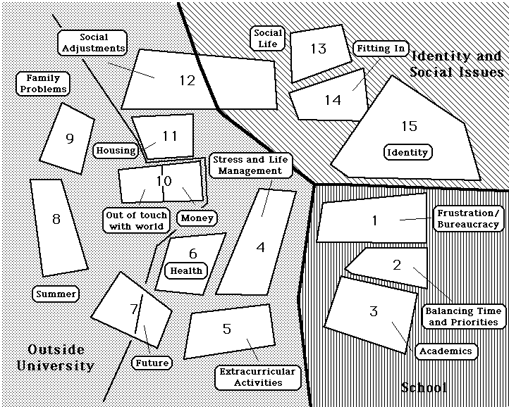
What is perhaps most striking is the degree to which this map resembles the structure of the map in the previous student life study shown in Figure 8. The three regions were very similar: Identity and Social Issues (Figure 9) is similar to Self and Others (Figure 8); School (Figure 9) is similar to Academic Issues (Figure 8); and Outside University (Figure 9) is similar to Life Issues (Figure 8). Even at the cluster level there seems to be a great deal of similarity. For instance, in both figures clusters related to stress turned up near the center of the map. In fact, if the two maps are rotated (while preserving the interrelational structure) it is possible to actually overlay the two figures and achieve a fairly good correspondence. This occurs in spite of the fact that the studies were conducted with two different groups of students -- the older R.A.s and the younger residents -- and that they involved completely independent processes (students in one were not aware of the other) from brainstorming through interpretation. This correspondence in concept maps may suggest that there is some generalizable, consistent conceptual similarity which would be useful for building educational theory, a topic which will be discussed in greater detail later.
10. Community School of Music and Arts. The Community School of Music and Arts (CSMA) is a resource for instruction in music, art and dance, and is a center for cultural activity in the community which it serves. The goal of this concept mapping process was to involve the Board of Trustees in the development of a framework for CSMA programs and services. Ten members of the Board of Trustees participated in two sessions. To generate the statements they used the focus prompt: "Knowing what you know about the Community School, identify items which will help insure its continued growth." Fifty-four statements were generated and the final map which resulted is shown in Figure 10.
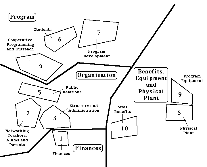
There were four major regions -- Organization; Finances; Program; and, Benefits, Equipment and Physical Plant -- and ten clusters. The map was used to plan for program development and fund raising. In addition, one of the major uses of the map was to encourage greater unity and cohesiveness between the trustees and faculty as they jointly participated in additional planning.
11. Alumni Affairs. The alumni Regional Directors supervise offices throughout the country which maintain contact with and provide services to graduates of a major university. This project was designed to help them conceptualize the major issues which their jobs and offices address. Between 10 and 15 regional directors generated 72 statements which describe "activities and services which your office provides or might provide." The final map, shown in Figure 11, is divided into five major regions and fifteen clusters.
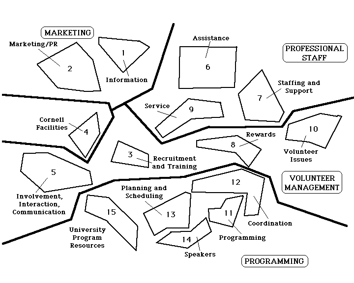
The clusters at the bottom of the map were related to program issues while the others were more concerned with the management of the alumni offices themselves (i.e., marketing, professional staff, and volunteer management). On the basis of this map, the alumni directors could devise new programs and approaches for improving services.
12. Student Life (student assembly). The student assembly is the central student governance body in a major university. They used concept mapping to help them to identify the issues which they might address during the next academic year. Approximately 20 elected student representatives generated 87 statements which "describe issues in students' lives which the student assembly might address." The final map is shown in Figure 12.
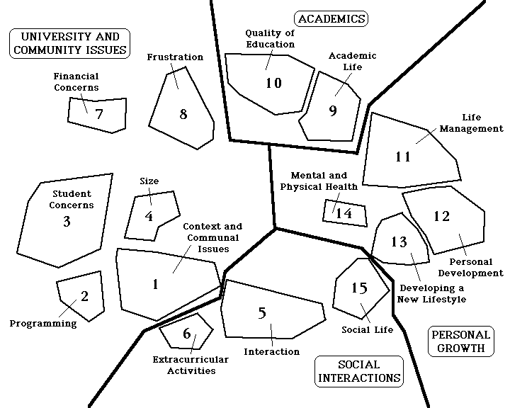
One striking feature of this map is the degree to which it resembles the two maps discussed earlier (at least at the regional level) in connection with student life issues (Projects 8 and 9 above). There are four identifiable regions -- Academics, Personal Growth, Social Interactions, and University and Community Issues -- and 15 clusters. More will be said about similarities between concept maps below.
13. Employment. Between 8 and 10 persons representing various groups involved in employment participated in this project, including members of the County Board, the Department of Social Services, and various agencies which provide employment services. They generated 90 statements which described "issues related to employment services in the county." The final map is shown in Figure 13.
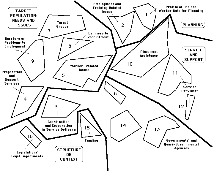
Five regions and 16 clusters were identified. The largest region in the upper left of the map described the needs and issues of the target population. The "context" region in the lower left was related to legislative and funding issues. The region which extended from the center of the map to the lower right referred to inter-agency coordination -- an issue of clear importance to the representatives of the different agencies who participated in this process and compete for clients, resources, and support. The region in the upper right is related to planning such things as employment training and to better understanding the demographics of the working population in that area. Finally, the "service and support" region had to do with the direct services -- such as job placement -- which various agencies provide.
14. Personnel Management. In this project, a four-person department at a water filtration plant wished to examine the current job responsibilities for persons in the department and the need for additional personnel. All four men (including the supervisor) participated in the brainstorming session which yielded 74 statements describing the different tasks which they perform in their jobs. Because there were only four people, each was asked to sort the statements twice. In addition, each was asked to check on a rating sheet any of the tasks which they themselves routinely perform on the job. The final map is shown in Figure 14.
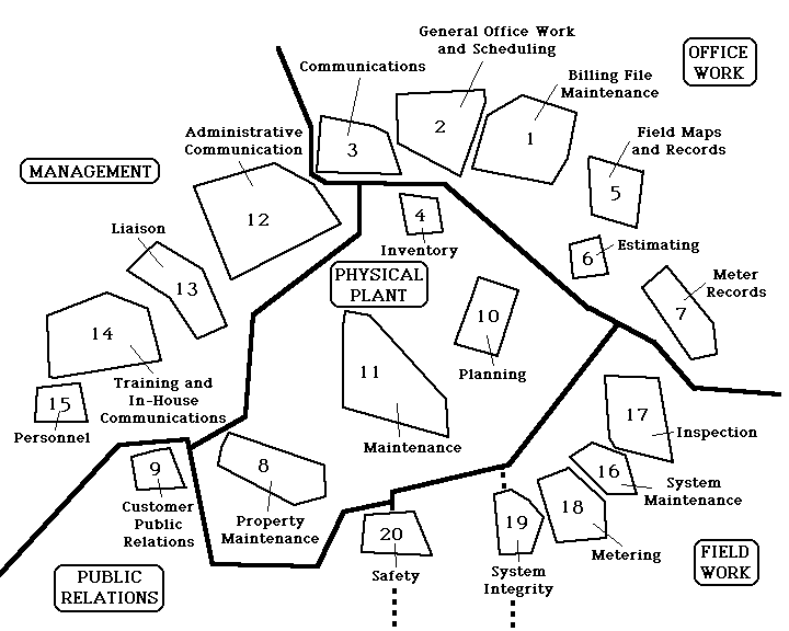
There were five major regions and twenty clusters identified. In addition, maps were produced for each of the four individuals (not shown) showing the statements on the map which they had some responsibility for. It was immediately apparent that there were few well-delineated areas of responsibility -- each person wound up doing tasks from all over the map. On the basis of this map, the participants decided to do one additional step to assist them in planning. First, they rated each cluster for how many man-hours they needed to accomplish that task ideally in a typical month. Second, they rated (individually and then totally) how many man-hours they currently spend on each task in a typical month. These two ratings could then be graphed onto the map in Figure 14 to provide a visual indicator of where they believe they are most discrepant from the ideal in terms of personnel resources. Assuming that there are discrepancies, they might then reallocate current job responsibilities and/or use that information as justification for an additional personnel request. A mapping of job responsibilities like this one may enable an organization to identify areas where they have over or under-committed personnel and resources.
15. Counseling Services. A counseling agency which provides a wide range of mental health services wished to develop a conceptual framework for its long-term strategic planning effort. A small group consisting of 10-15 key staff members and members of the Board of Directors generated 80 statements which described services which the agency does or might provide. In addition to sorting these statements, each person rated them on a 1 (lowest priority) to 5 (highest priority) scale. The final rating concept map is shown in Figure 15.
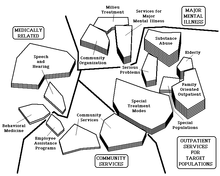
Four regions and 15 clusters were identified. At the top of the map are clusters related to major mental illness which in the past has been the primary service focus for this organization. On the left are medically related services. Community services are on the bottom and specially targeted outpatient services on the right. The highest priorities were given to the clusters for substance abuse, family oriented outpatient services and services for the elderly. While the first two had already been addressed to some extent by the agency, there was currently no program for the elderly. Consequently, one outcome of this process was the recognition that they wished to consider what services might be needed by the elderly. They decided that the best way to begin to address this task would be to involve other local agencies with responsibilities for the aged to join in a concept mapping process on that topic (see project 17 below). In addition, they intend to use the map as the basis for examining planning data such as budgetary and staff time allocations by cluster, competition from other agencies for services in each cluster, and so on. Just as with the priority ratings, each of these additional variables can be overlaid on the original concept map to provide a visual display of the data.
16. Senior Citizens. A consortium of organizations which deal with senior citizens wished to use concept mapping to identify the issues which needed to be addressed in their area. Between 10 and 15 staff and Board members participated. They generated statements which represented what they believed needed to be addressed in order to improve services to the elderly. The final map is shown in Figure 16.
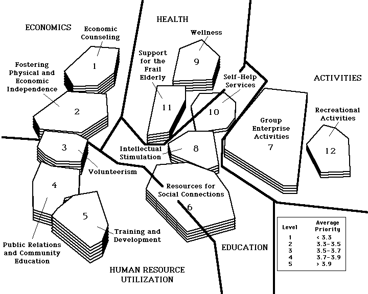
Five regions and 12 clusters were identified. Clearly, clusters on the left of the map (and especially on the lower left) were judged as more important. Thus, training and development, community education, and volunteerism were considered areas which needed special attention, whereas self-help services and recreational activities did not.
17. Elderly. This project emerged from project number 15 described above. On the basis of that earlier project, an agency identified services for the elderly as a priority for planning. In order to begin addressing this, they assembled a consortium of agencies which deal with the elderly in their county, including representatives of the United Way and of health and mental health services. The 10-15 participants generated 95 statements which described "the issues, problems, concerns or needs which the elderly have in the county." In addition to sorting, each participant rated the statements on a 1 (lowest priority) to 5 (highest priority) scale. The final map is shown in Figure 17.
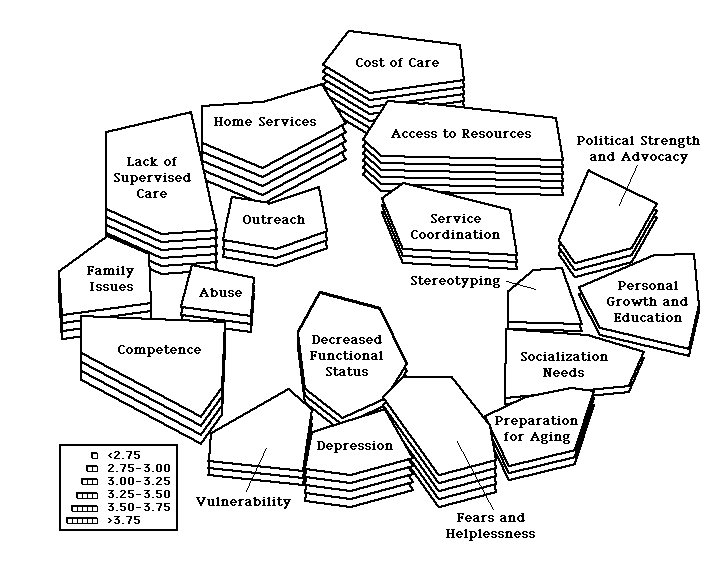
There were 18 clusters identified and the group did not wish to define regions on the map. The most intriguing result of this process was the sense within the group that they had hit upon a "theory" regarding the development of the elderly. They suggested that the map could be interpreted nicely in a counter-clockwise manner beginning with the rightmost cluster, personal growth and education. The "healthy" elderly would view this as a priority (along with socialization) and are also the most likely to be politically active and powerful. Consequently, much of the political power available to the elderly is spent on advocacy for issues for the well elderly. As people grow older (continuing counter-clockwise) they increasingly run into issues related to access to resources (e.g., coordination of local services, costs). Eventually, housing issues become more predominant involving questions about home care, outreach, supervised care, and the potential for abuse. Clearly at this point the family is extremely relevant and likely to be involved in the decision making. Eventually with advanced age there are issues of competence, vulnerability, depression, fears and helplessness and, ultimately, decreased functioning and death. This counter-clockwise interpretation led to a stimulating discussion where participants concluded that it was important to intervene early in this cycle and involve the well-elderly as advocates for issues which are on their horizon. In addition, the map is being used as the basis of an examination of current service patterns in the county (by cluster) to determine whether the agency which initiated this project should continue to consider developing services in this area.
18. Arts Council. An Arts Council which is responsible for fostering and encouraging cultural and artistic efforts in their county wished to use concept mapping as the basis of their long-term planning process. Approximately 10-15 members of the Board of Directors generated 63 statements which described "what should be done by an effective Arts Council." In addition, each participant rated each statement on a 1 (lowest) to 5 (highest) priority scale. The final map which resulted is shown in Figure 18.
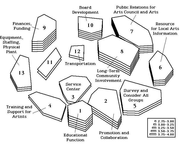
The Arts Council is a relatively small organization (1 FTE professional, a part time secretary, and volunteers) which means that it relies on its Board Members more directly to be active in the addressing the mission of the organization. Prior to the concept mapping, there was little consensus among Board Members concerning what their roles and functions should be. On the basis of this project, they were able to identify their major tasks as helping to seek funding, encouraging the educational function of the Council, long-term community involvement, and public relations for the Arts Council and the arts in general. In addition, they clearly saw the need for ongoing and expanded Board development efforts.
19. Planned Parenthood. A Planned Parenthood organization wished to use concept mapping as the basis for long-term planning. They involved a relatively large group of between 30 and 35 staff and board members in generating 89 statements which described issues which they needed to address in the longer term future. The final map (with priority ratings) is shown in Figure 19.
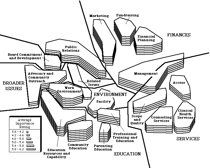
There were 7 regions and 18 clusters identified. In the interpretation, it became apparent that the region pertaining to education on the lower left was given the highest priority, closely followed by financial issues and public relations concerns.
20. Music and Arts in Daycare. In this project, concept mapping was used to develop the framework for constructing training sessions for daycare providers in music and art activities for preschool children. Between 10 and 15 daycare providers generated 61 statements which described the types of issues which they wished to see addressed in training in music and arts. In addition, each participant rated each statement on a 1 (not at all) to 5 (extremely) importance scale. The final map is shown in Figure 20.
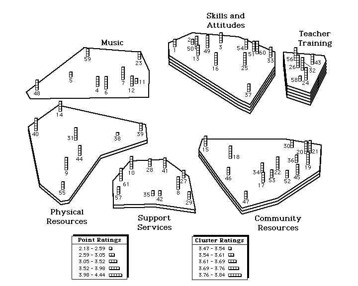
Six clusters were identified in the analysis. The highest importance was assigned to teacher training issues, followed by issues related to the skills and attitudes which teachers were expected to have. The clusters and individual statements were used to plan for the workshops which were later administered. Thus, in this case, concept mapping enabled the client group to devise the issue structure for their own training.
The initial motivation for the development of the concept mapping process described here was largely scientific. The thought was that concept mapping could help in the articulation of the concepts used in social research and in their translation into operationalizations. From the outset it was important to establish: 1) that the concept mapping process provided an accurate representation of what people were thinking (i.e., reliability and validity), and; 2) that the concept maps could be integrated into scientific theory-building and experimentation. These two issues are considered separately below. At this point, it is not clear how well the concept mapping process addresses these two issues and so the discussion here will be preliminary in nature and largely suggestive of some of the methodological research which might be undertaken to investigate these concerns further.
Reliability and Validity of Concept Mapping. To date, there have been no major attempts to investigate the reliability and validity of concept mapping. For purposes of discussion , reliability will be understood here to mean the degree to which a map is "repeatable." Validity is meant to refer to the degree to which a map accurately reflects reality.In terms of reliability, there are a number of questions which could be asked -- one could look for overall replicability (e.g.,similarity across maps), or look at the reliability of a specific step in the process. A number of studies suggest themselves:
For each of these, one could look at the degree to which the same individual or group gets similar results on multiple occasions or the degree to which several equivalent groups (i.e., randomly assigned) independently produce similar results. For instance, we could assess the degree to which we get similar maps when we perform the same process twice on the same group of participants at two different times (a type of test-retest reliability) or we could look at the degree of similarity between maps based on separate processes carried out simultaneously by random subgroups of the same population (actually, a type of convergent validity). Each type of study would pose it's own methodological difficulties. For instance, how would one assess the degree of similarity between two sets of brainstormed statements, two sets of cluster labels, or two maps which were constructed using entirely separate processes? For the reliability of sorting it would be possible to correlate participant's binary similarity matrices. Reliability of ratings could be assessed with a simple correlation between the ratings.
While no direct evidence is available on reliability, we can get a rough indication by visually examining maps from similar populations on similar topics. For instance, it is clear from the presentation of projects above that several of the maps which describe issues in students' college lives (Figures 8, 9 and 12) have some striking similarities in features despite the fact that they were the results of three entirely different processes with three very different groups of students at three different times. Or, one could look at the similarity between maps from similar organizations, such as the projects from the Community School or Music and Arts (Figure 10) and the Arts Council (Figure 18); or from similar topic areas such as aging (Figures 16 and 17). In all of these cases, however, the projects differed in important ways which might minimize the degree to which we would expect similarity in concept maps. For instance, the purpose of Project 9 was to have Residence Advisors project what they thought the issues were in undergraduates lives whereas in Project 10 the students were asked directly what the issues are. Lack of agreement between maps could thus be attributable either to low reliability or to the different nature of the projects. Clearly, there is a need for research which is explicitly constructed to examine reliability issues. In terms of validity of concept mapping, the only direct evidence on the question comes from the work undertaken by Dumont (this volume) who looked at the degree to which computed concept maps correlated with hand-placed maps (a type of convergent validity). The evidence is somewhat ambiguous and seems to indicate that estimates of validity depend largely on the level at which one looks for agreement and the manner in which the validity estimate is computed. Although the preliminary results are promising, Dumont's work needs to be replicated with more people, different types of participants, and in different subject areas.
There are several general approaches which might be taken in investigations of the validity of concept mapping. One method would be to compare concept maps (or results of any step in the process) with comparable information generated by some other method, as Dumont (this volume) did when looking at computed versus hand-placed maps. For instance, one could compare a set of brainstormed statements with transcripts of interviews on the same topic to see whether similar issues arise.
A second method for examining validity would be to see whether participants could identify the "correct" concept map from a set, much like a witness identifying an accused criminal in a line-up. For instance, let's say that in addition to generating the computed concept map for a project we also generate three more maps which have the same statements on them but where the statements are randomly placed on the map. The validity question is whether the participants could identify the computed map as the one which most accurately reflects their thinking. Incidentally, this type of study, more than almost any other, addresses the distinction between soft science and hard art raised here. If participants cannot distinguish the map computed from their data from randomly generated ones, there would be no effective argument for the validity of this process. On the other hand, if we asked people to tell us which maps were the most suggestive, interesting, or creative, it might very well turn out that randomly-generated ones would be chosen. After all, if people can sensibly interpret randomly generated ink blots in psychological testing, why wouldn't they be able to form interpretations of random concept maps (which would still use the statements which they brainstormed)? In fact, there is some reason to think that deliberate random arrangement of statements on a map -- while not meeting the standard of validity (or accuracy in representing what the participants actually think) -- might be a good method for getting people to see new relationships and to think creatively.Finally, it would be possible to examine validity by looking at whether concept maps confirm theoretically expected differences. For instance, we might have two groups of participants -- say, teachers and students -- involved in a study where we have some clear idea of how we expect these groups to differ in their conceptualizations. Comparison of their concept maps could help to confirm or deny our expectation. Similarly, we might have students do a conceptual map at the beginning and end of a course and see whether any changes in the structure of the map correspond to what was communicated in the course or whether the final map is more like the teacher's than the initial one was.
How might concept mapping be useful in the social sciences? Consider the plight of the graduate student who needs to define the major constructs for a dissertation project. While all of the texts on research say that is is important to define constructs, there is no concrete advice given on how to articulate a conceptual framework. The concept mapping approach views concept definition as a measurement task -- much like that of developing a scale. The student generates lots of statements which described the construct(s) in question, and then organizes those statements in some way. Or, consider the lack of conceptual clarity in much of the psychological research which is published -- a sentiment well articulated by Sartori (1984) for psychology and the other social sciences. For instance, what are the distinctions/relationships between terms like "self esteem", "self worth", "self image", "locus of control", "dependency", and so on? Or, what are the distinctions/relationships between the terms "intelligence", "achievement", "academic performance", and so on? In addition, over the past few years there has been a growing recognition in the field of evaluation research that improvement is needed in the types of theories which guide evaluation projects. In particular, Bickman (1986) has called for more theory-driven evaluation and Chen and Rossi (1983; 1987) have argued that "grand" social science theory about social programs needs to be augmented by or replaced with more concrete theories about how programs function in real-world settings. All of these considerations suggest that concept mapping might be useful for improving theory-building in the social sciences.
It is important to distinguish between theories and concepts. One thing to recognize is that while theories are built upon concepts, concepts are not, in and of themselves, theories. The concept maps shown in this paper do not necessarily constitute theories. A theory postulates a relationship -- usually causal -- between two or more concepts. A concept map provides a framework within which a theory might be stated. Perhaps an example would help to clarify the distinction. Let's assume that we are interested in evaluating a program designed to improve the self esteem of a certain group of high school students. In trying to define self esteem we use concept mapping to describe all of the terms we can think of which are related to our notion of self esteem. Presumably, terms which are more similar in our minds will be closer on the map. In this way we might distinguish several sub-aspects of self esteem and might set self-esteem within a broader framework of other concepts related to the self. However, the concept map itself does not constitute a theory regarding the effect of our program on self esteem. To achieve such a theory we need to state how the independent variable (i.e., the program) is related to the concepts on the map. For instance, after reviewing the program in detail, we might conclude that some aspects of self esteem on the map will most likely be more strongly affected than others. Specifically, we have overlaid our expectations about program effects onto the conceptual structure, showing where it will affect some concepts and not others. Thus, concept maps can act as the framework for a statement of theory, but are usually not considered a theory in and of themselves.
This discussion suggests that concept mapping may be particular useful for theory-driven social research because of its detailed, visual, pattern-based representation of concepts. Trochim (1985; in press) has described this under the framework of "pattern matching." In pattern matching, one needs a theoretical pattern and an observed one. The theoretical pattern should describe the relationships or outcomes which are expected. The observed pattern consists of the relationships or outcomes which are measured. To the extent that these patterns match and there are no other theories which would account for the observations as well, one can conclude that the theory in question is supported. Pattern matching works best when there is a clearly articulated, detailed theoretical pattern because detailed patterns are more likely to be unique and a match will, consequently, be attributable to this unique theoretical "fingerprint." Concept mapping is particularly valuable for pattern matching because it can help researchers to generate (scale) their theoretical expectations in detail.
Pattern matching is a general approach to research. In evaluation, it can help to guide the development and assessment of the program, sample, measures and outcomes. If concept mapping has utility here, it's value will be far-ranging. The theory of pattern matching is discussed in greater detail in Trochim (1985, Chen and Rossi, 1983; 1987) and is illustrated by the papers in this volume by Davis, Marquart and Caracelli. We have only begun to explore the use of concept mapping for pattern matching methods. For instance, Trochim (1988) shows how concept maps can be used as the framework for exploring patterns in randomized clinical drug trial data. More research is needed on the utility of concept mapping for scientific theory building in general and for pattern matching in particular.
Bickman, L. (Ed.). (1986). Using program theory in evaluation. New Directions for Program Evaluation. San Francisco, CA: Jossey-Bass.
Chen, H.T. and Rossi, P.H. (1983). Evaluating with sense: The theory-driven approach. Evaluation Review. 7, 283-302.
Chen, H.T. and Rossi, P.H. (1987). The theory-driven approach to validity. Evaluation and Program Planning. 10, 95-103.
Gurowitz, W.D., Trochim, W. and Kramer, H.C. (1988). A process for planning. National Association of Student Personnel Administrators Journal. 25, 4, 226-235.
Sartori, G. (1984). Social Science Concepts: A Systematic Analysis. Beverly Hills, CA: Sage Publications.
Trochim, W. (1985). Pattern matching, validity, and conceptualization in program evaluation. Evaluation Review, 9, 5, 575-604.
Trochim, W. (1988). The effect of Aplrazolam on panic: Patterns across symptoms. Unpublished manuscript, Cornell University.
Trochim, W. (in press). Pattern matching and program theory. Evaluation and Program Planning.
Trochim, W. and Linton, R. (1986). Conceptualization for evaluation and planning. Evaluation and Program Planning, 9, 289-308.
| 1. Multicultural Awareness | Summer 83 | 12* | core staff | 74 |
| 2. Division of Campus Life | Winter 83 | 45* | staff - all levels | 137 |
| 3. University Health Services | Spring 84 | 50-75 | all staff | 100 |
| 4. DCL Subcommittee | Fall 84 | 11 | dept. representatives | 11 |
| 5. Mental Health Association | Fall 84 | 8-12 | board members | 80 |
| 6. Teaching Measurement | Fall 85 | 20* | graduate students | 50 |
| 7. Cooperative Extension | Fall 85 | -- | staff | 75 |
| 8. Student Life (R.A.s) | Fall 85 | 12 | undergraduate students | 129 |
| 9. Student Life (dorm residents) | Spring 86 | 10 | undergraduate students | 46 |
| 10. Community School of Music and Arts | Summer 86 | 10 | board members | 54 |
| 11. Alumni Affairs | Summer 86 | 10-15 | staff | 72 |
| 12. Student Life (Student Assembly) | Summer 86 | 20* | undergraduate students | 87 |
| 13. Employment | Summer 86 | 8-10 | agency representatives | 90 |
| 14. Personnel Management | Fall 86 | 4 | all staff | 74 |
| 15. Counseling Services | Fall 86 | 10-15 | staff and board | 80 |
| 16. Senior Citizens | Spring 87 | 10-15 | staff and board | -- |
| 17. Elderly | Winter 87 | 10-15 | agency representatives | 95 |
| 18. Arts Council | Winter 87 | 10-15 | staff and board | 63 |
| 19. Planned Parenthood | Spring 88 | 30-35 | staff and board | 89 |
| 20. Music and Arts in Daycare | Spring 88 | 10-15 | daycare providers | 61 |
| 1. Multicultural Awareness | |||||||
| 2. Division of Campus Life | |||||||
| 3. University Health Services | |||||||
| 4. DCL Subcommittee | |||||||
| 5. Mental Health Association | |||||||
| 6. Teaching Measurement | |||||||
| 7. Cooperative Extension | |||||||
| 8. Student Life (R.A.s) | |||||||
| 9. Student Life (dorm residents) | |||||||
| 10. Community School of Music and Arts | |||||||
| 11. Alumni Affairs | |||||||
| 12. Student Life (Student Assembly) | |||||||
| 13. Employment | |||||||
| 14. Personnel Management | |||||||
| 15. Counseling Services | |||||||
| 16. Senior Citizens | |||||||
| 17. Elderly | |||||||
| 18. Arts Council | |||||||
| 19. Planned Parenthood | |||||||
| 20. Music and Arts in Daycare |
| 1. Multicultural Awareness | ||||||
| 2. Division of Campus Life | ||||||
| 3. University Health Services | ||||||
| 4. DCL Subcommittee | ||||||
| 5. Mental Health Association | ||||||
| 6. Teaching Measurement | ||||||
| 7. Cooperative Extension | ||||||
| 8. Student Life (R.A.s) | ||||||
| 9. Student Life (dorm residents) | ||||||
| 10. Community School of Music and Arts | ||||||
| 11. Alumni Affairs | ||||||
| 12. Student Life (Student Assembly) | ||||||
| 13. Employment | ||||||
| 14. Personnel Management | ||||||
| 15. Counseling Services | ||||||
| 16. Senior Citizens | ||||||
| 17. Elderly | ||||||
| 18. Arts Council | ||||||
| 19. Planned Parenthood | ||||||
| 20. Music and Arts in Daycare |